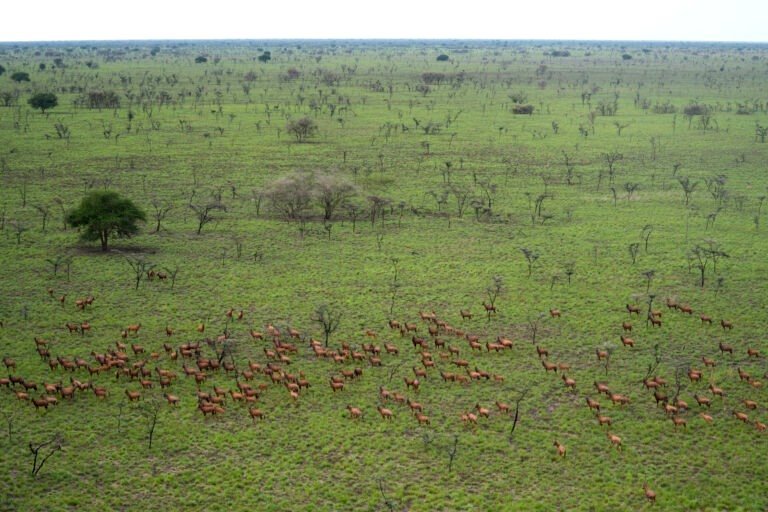
The map created by conservationists in South Sudan displays lines that appear like delicate strands of a spider’s web. These are referred to as the “lines of life.” The map combines millions of data points from GPS collars placed on 262 migratory antelopes since 2023. Each color on the map represents one of four migratory species: the white-eared kob, tiang, Mongalla gazelle, and bohor reedbuck. Together, these species contribute to the Great Nile Migration Landscape, which supports the largest mammal migration globally, involving about 6 million animals.
The different colors indicate specific species: yellow for tiang, red for bohor reedbuck, blue for white-eared kob, and white for Mongalla gazelle. Most of the animals’ movements take place outside Boma and Badingilo national parks, in an area that is also home to roughly 1 million people and their livestock, alongside expanding towns, roads, and mines. The “lines of life” provide valuable insights for conservationists regarding wildlife movement. Megan Claase, a conservation manager for African Parks, which works with the South Sudanese government to manage these parks, noted that they have identified key wildlife corridors and high-use areas for the animals.
This information is crucial for directing conservation efforts to support the continued movement of wildlife. How might this map change conservation strategies going forward?
Sources:
Source: Mongabay Animals, by Terna Gyuse